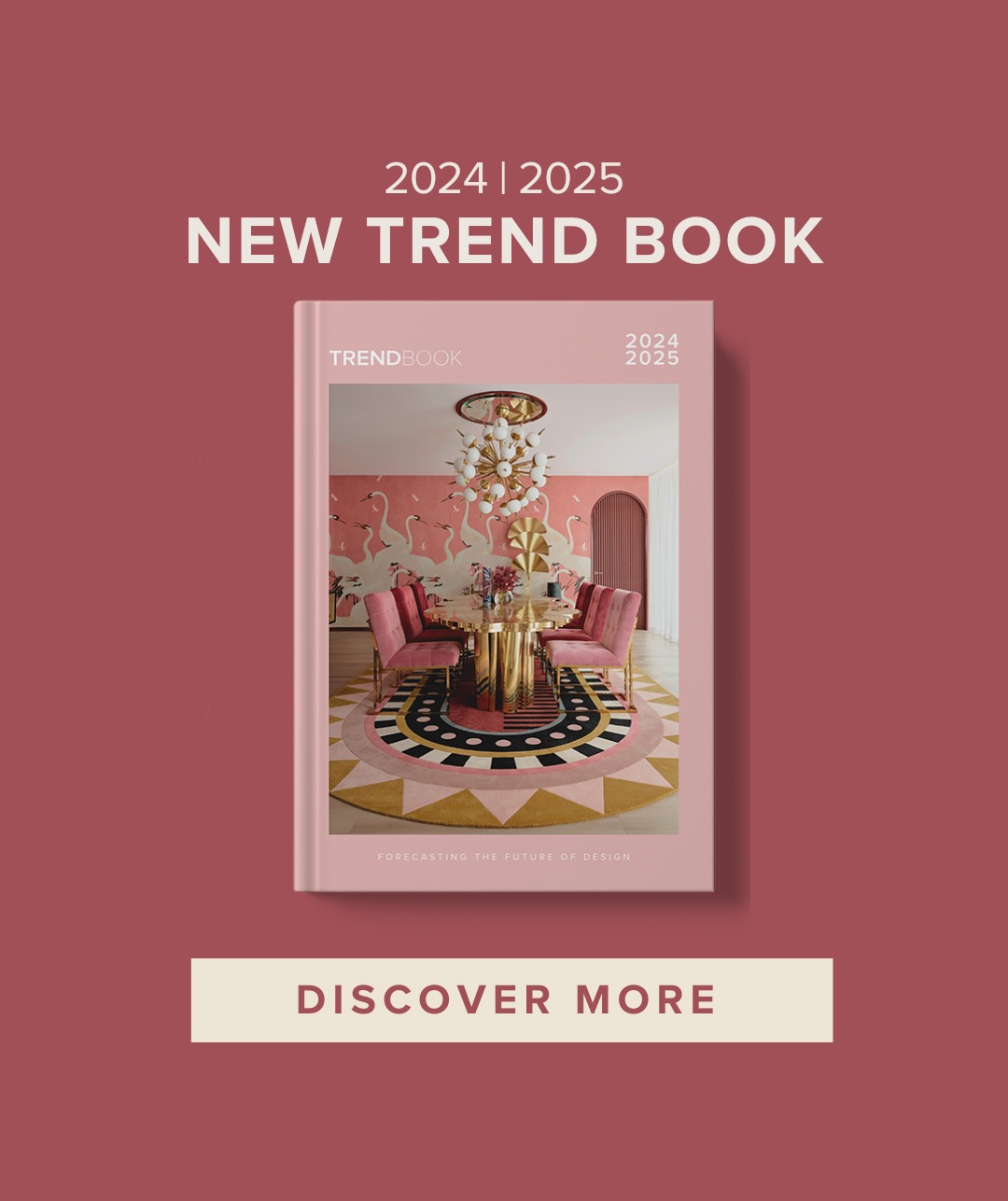
70’s design color trend is filled with earthy neutral shades from nature with bold colour associations. Rich hues such as yellows, oranges and greens that go perfectly with different textures like corduroy and shag pile. Revive this nostalgic trend and bring a sense of warmth and comfort into your house.
If you want to recreate this retro trend in your interior design project, pick geometric shapes and mosaics to complement the neutral color palette.
LET’S TALK ABOUT TEXTURES
This is the perfect trend to all fans of soft charming fabrics. You can incorporate a large variety of fabrics in your interior design from corduroy, to soft glowing velvet. Take risks and experience with this different materials and textures, combine them all with different colour. And as always don’t be shy and bring indoor plants, especially ferns and palm vases to keep with the 70’s nostalgic feeling.
DARK WOOD CANVAS
Bring a sense of depth and contrast using dark wood, from the furniture you choose to the floors or walls, it sure is going to be the perfect canvas for your interior design project.
RICH COLOUR DESIGNS
Intensify the neutral colour scheme with statement luxurious pieces in deep colours such as yellow mustards, rich greens, blues, or even a dusty rose for a soft side. Whatever colour design you choose just make sure it represents the mood you want.


All credits to owners.
*Like what you’ve read about the 70’S design color trend rules? Feel free to share on your social media by using the super-easy share buttons on the left! If you want to see other decor and interior trends just click here.*| Don’t forget to follow us on our social media, Facebook, Instagram, and Pinterest.


