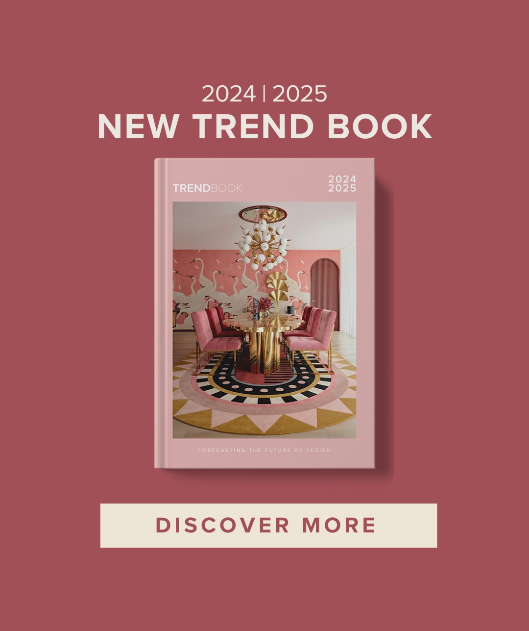
Sometimes, a trend comes along that’s a straightforward counter to the current, there to thrust a great big dollop of unbridled joy into our lives, and Happy Design, is just that one of the happy ones, to bring us color to our life.
In other words, it is no oddity, it’s predictable, following on from the rise and return of gold (brighter, louder, look-at-me), and being a grand coda confirmation of the rejection of black.


The happy design represents a sense of really throwing designedly caution to the wind. In an almost complete volte-face to the new neutrals, there’s a move to take those gentle retro colors and to seriously brighten, heighten and vibrantly mix and mismatch them in a very jolly and upbeat way.


The ‘Happy’ palette is still somewhat old-fashioned (burgundy, mustard, peachy pinks and turquoises etc), each hue has simply had a massive shot of intensity to render it out, loud and proud rather than soothing per se.
It’s a statement too that the style pendulum has swung as far as it can go from the bland do-it-up-to-sell mentality of latter years towards a deeply personal style of home-making that’s not been seen in a while.


What’s especially intriguing to me though, is that for once, this ‘homes look’ is happening in fashion too. Style mavens talk breathlessly of ‘colour blocking’ and ‘technicolour dream seasons’ courtesy of new labels such as Sies Marjan, by Dutch designer Sander Lak, and even established brands like Gucci, have frankly gone a bit 1970s meets God-knows-what nuts for Spring Summer 2018.


